> ## Documentation Index
> Fetch the complete documentation index at: https://lightdash-mintlify-cccf65ca.mintlify.site/llms.txt
> Use this file to discover all available pages before exploring further.
# Area chart
> Use area charts to show how values develop over time when the total is as important as its parts.
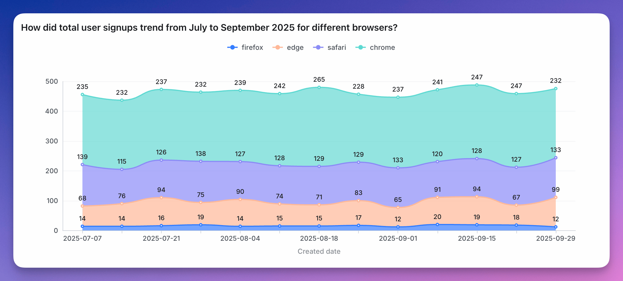 Area charts are best if:
* **you want to show how values develop over time.** If you want to show how values differ in different categories, consider a (stacked) bar, or horizontal bar chart instead.
* **the total is as important as its parts**. If the total (= the height of all your stacked areas) is not important, consider a line chart instead. Many readers will have an easier time understanding a line chart than an area chart.
* **there are big differences between your values**. If the differences between your values are very small, consider a line chart instead. Compared to an area chart, the y-axis of a line chart doesn't need to start at zero. This means that your y-axis can be stretched to show the tiny differences.
* **you're showing multiple series over time**. If you just want to show one value over time, also consider a line chart instead; especially if you don't want your y-axis to start at zero. If you only have a few dates, you can also consider using a column chart. In both cases, labelling will be better.
* **you have many data points**. If you have less than ten or so data points, consider a stacked bar chart instead.
You can see more details about area chart configurations [here](/guides/configure-charts).
Area charts are best if:
* **you want to show how values develop over time.** If you want to show how values differ in different categories, consider a (stacked) bar, or horizontal bar chart instead.
* **the total is as important as its parts**. If the total (= the height of all your stacked areas) is not important, consider a line chart instead. Many readers will have an easier time understanding a line chart than an area chart.
* **there are big differences between your values**. If the differences between your values are very small, consider a line chart instead. Compared to an area chart, the y-axis of a line chart doesn't need to start at zero. This means that your y-axis can be stretched to show the tiny differences.
* **you're showing multiple series over time**. If you just want to show one value over time, also consider a line chart instead; especially if you don't want your y-axis to start at zero. If you only have a few dates, you can also consider using a column chart. In both cases, labelling will be better.
* **you have many data points**. If you have less than ten or so data points, consider a stacked bar chart instead.
You can see more details about area chart configurations [here](/guides/configure-charts).