> ## Documentation Index
> Fetch the complete documentation index at: https://lightdash-mintlify-cccf65ca.mintlify.site/llms.txt
> Use this file to discover all available pages before exploring further.
# Configure your charts
> Learn about the configuration options available for most chart types in Lightdash.
Most chart types have very similar configuration options, so we put them all together below.
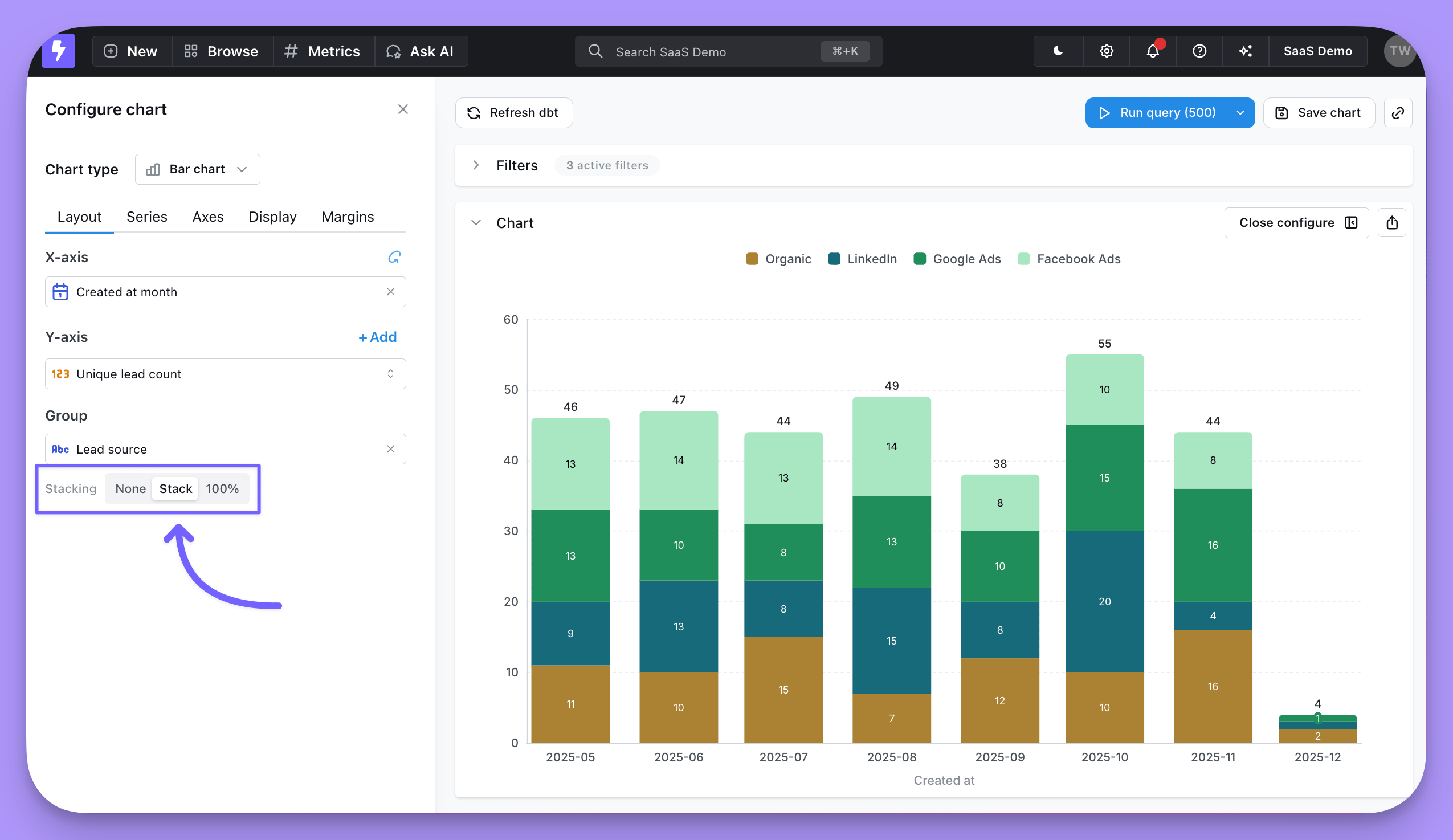
## Layout
This is where you can pick the columns from your results table that you want to plot on your x and y axes or that you want to group by.
You can group by up to 3 fields in your chart.
For bar charts, this is also where you have the option to stack your bars, or leave them unstacked (grouped).
 ## Series
The series tab is where you can adjust how your chart shows each data series. A **data series** is a set of related data points plotted on a chart. For example, the number of new users created each day over a set of dates is a series. In a bar chart, a series is represented by bars of the same color; in a line chart, a series is represented by a single line. You can see a list of the series for your chart in the **Series** menu, and on the chart legend.
## Series
The series tab is where you can adjust how your chart shows each data series. A **data series** is a set of related data points plotted on a chart. For example, the number of new users created each day over a set of dates is a series. In a bar chart, a series is represented by bars of the same color; in a line chart, a series is represented by a single line. You can see a list of the series for your chart in the **Series** menu, and on the chart legend.
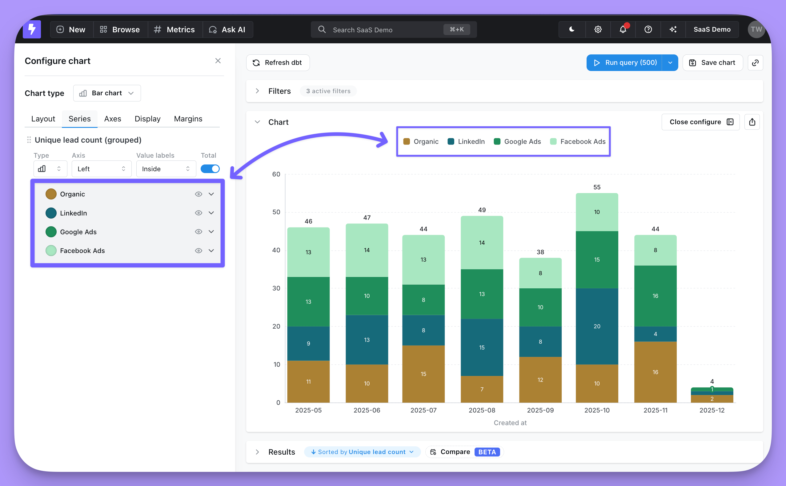 The options available in here will depend on the data in your chart. But, in here you can:
* Set the chart type for each series
* Change series labels or colors
* Put series on a left or right y-axis
* Show value labels or group totals on data points
* Hide a series from your chart
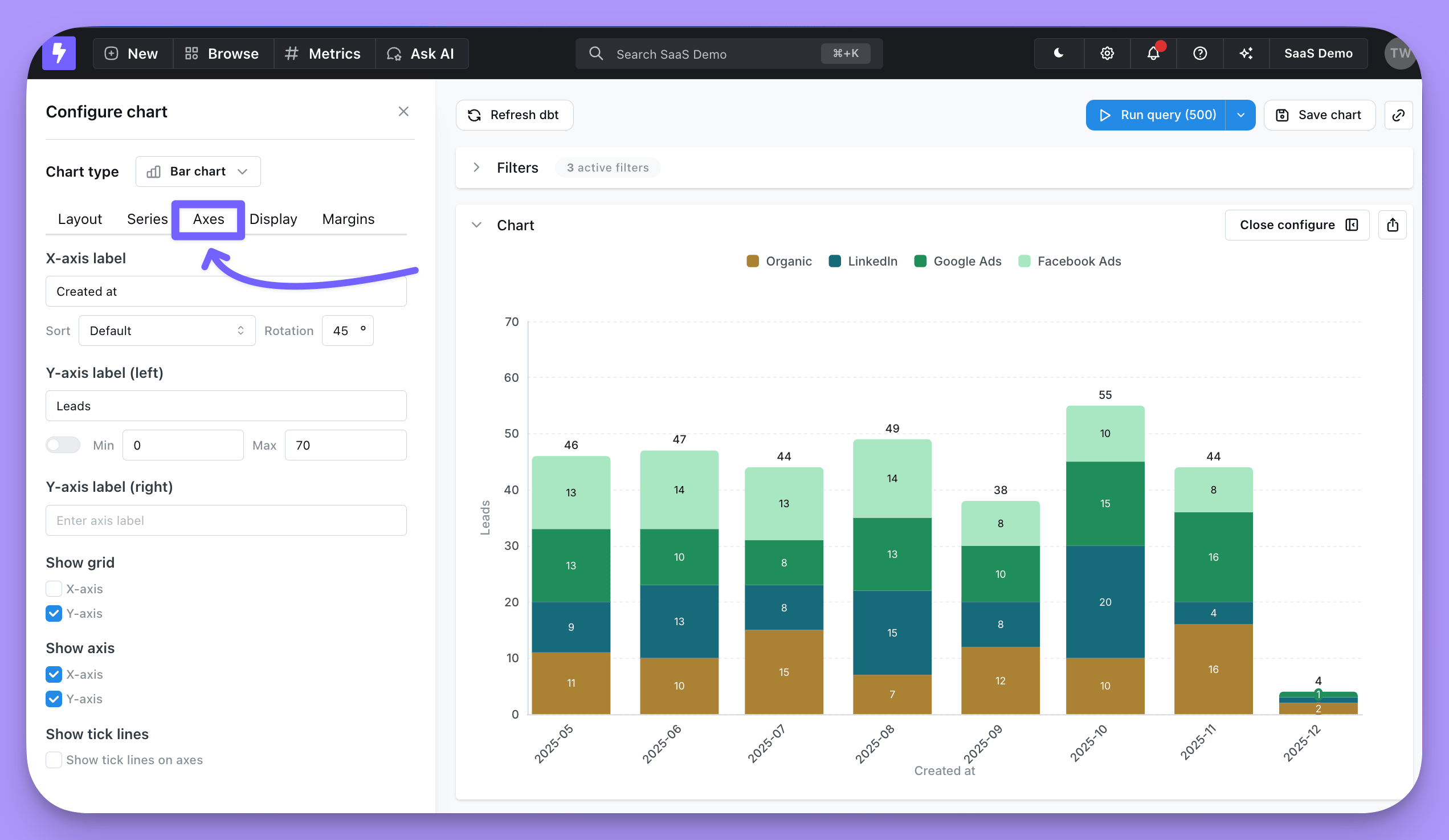
## Axes
In this section you have options to:
* Override the default text for your axes labels
* Adjust sort order of your x-axis
* Rotate x-axis labels
* Set the min and max axis values for your y-axes (or keep the default auto y-axis range)
* Show x-axis and y-axis grid lines
* Hide x-axis completely
* Hide y-axis completely
* Enable a scrollable chart for charts with many x-axis values
The options available in here will depend on the data in your chart. But, in here you can:
* Set the chart type for each series
* Change series labels or colors
* Put series on a left or right y-axis
* Show value labels or group totals on data points
* Hide a series from your chart
## Axes
In this section you have options to:
* Override the default text for your axes labels
* Adjust sort order of your x-axis
* Rotate x-axis labels
* Set the min and max axis values for your y-axes (or keep the default auto y-axis range)
* Show x-axis and y-axis grid lines
* Hide x-axis completely
* Hide y-axis completely
* Enable a scrollable chart for charts with many x-axis values
 ### Scrollable chart
For bar, line, and area charts with many x-axis values, turn on **Enable scrollable chart** to display a fixed-size window of data points that viewers can scroll through, instead of squeezing every value into the chart.
When enabled, you can configure:
* **Initial scroll position** — Choose whether the chart opens anchored to the **Start** (oldest or first values) or **End** (newest or last values) of the data. Use **End** for time series where the most recent values matter most.
* **Visible items** — Set how many x-axis items appear in the window at once (between 2 and 100, default 10).
Both settings are saved with the chart and are also respected when the chart is defined as code.
## Display
This tab is where you're able to control the legend, reference lines, and [custom tooltips](/guides/custom-tooltip) in your chart.
### Reference lines
You can add reference lines to your charts to easily visualize goals or thresholds.
### Scrollable chart
For bar, line, and area charts with many x-axis values, turn on **Enable scrollable chart** to display a fixed-size window of data points that viewers can scroll through, instead of squeezing every value into the chart.
When enabled, you can configure:
* **Initial scroll position** — Choose whether the chart opens anchored to the **Start** (oldest or first values) or **End** (newest or last values) of the data. Use **End** for time series where the most recent values matter most.
* **Visible items** — Set how many x-axis items appear in the window at once (between 2 and 100, default 10).
Both settings are saved with the chart and are also respected when the chart is defined as code.
## Display
This tab is where you're able to control the legend, reference lines, and [custom tooltips](/guides/custom-tooltip) in your chart.
### Reference lines
You can add reference lines to your charts to easily visualize goals or thresholds.
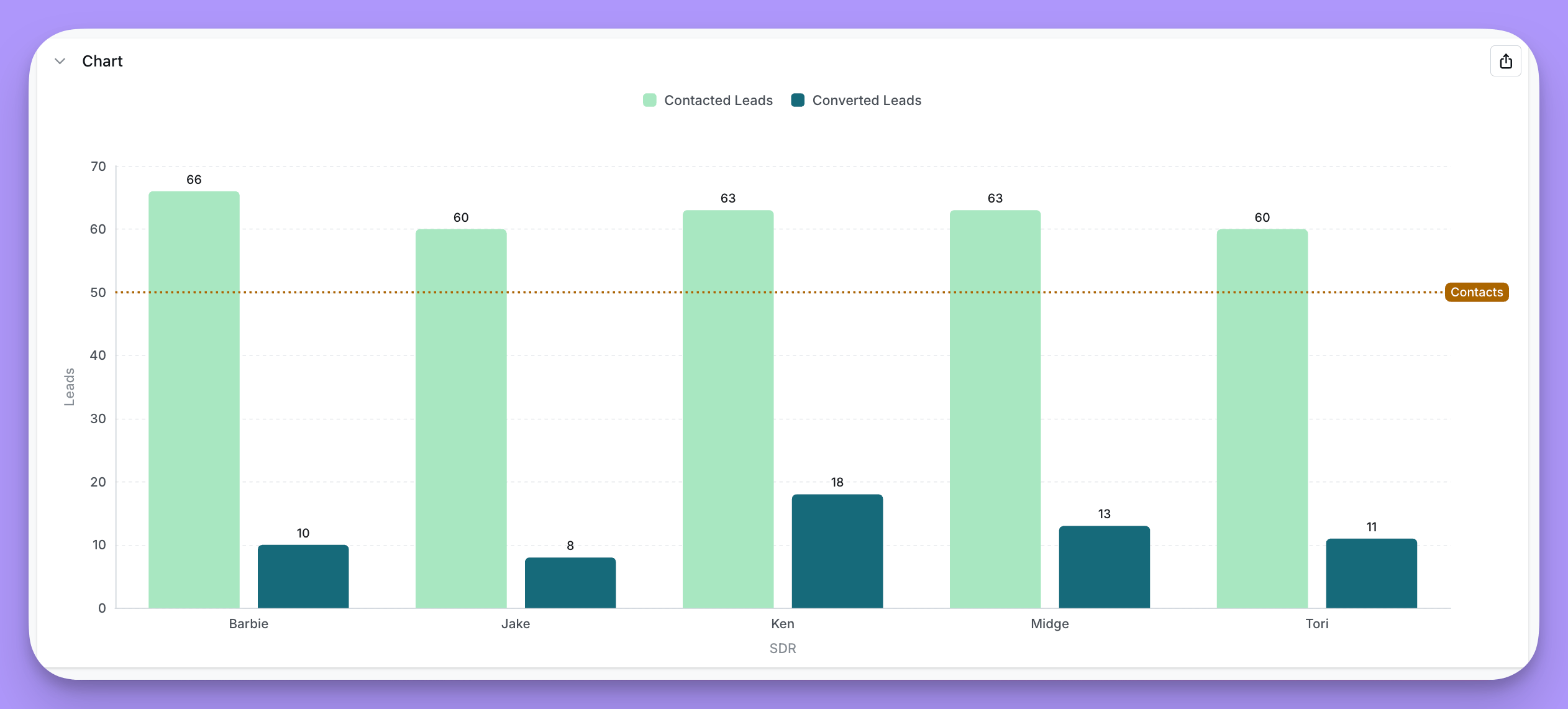 To add a reference line, click `+ Add` under Display -> Reference lines.
You have these options in the settings:
* Select a field you want to linke to your reference line (Page views in the image above)
* Set a static value (50,000 in the image above)
* Add a label (`Halfway to our goal!` in the image above)
* Change the line color (green in the image above)
Most reference lines are static values, but you can also use these key words to plot a dynamic value: `min`, `max`, `median`, `average`.
That way your reference line will automatically update to the global min, max, median, or average of the field you selected. See image below for examples.
To add a reference line, click `+ Add` under Display -> Reference lines.
You have these options in the settings:
* Select a field you want to linke to your reference line (Page views in the image above)
* Set a static value (50,000 in the image above)
* Add a label (`Halfway to our goal!` in the image above)
* Change the line color (green in the image above)
Most reference lines are static values, but you can also use these key words to plot a dynamic value: `min`, `max`, `median`, `average`.
That way your reference line will automatically update to the global min, max, median, or average of the field you selected. See image below for examples.
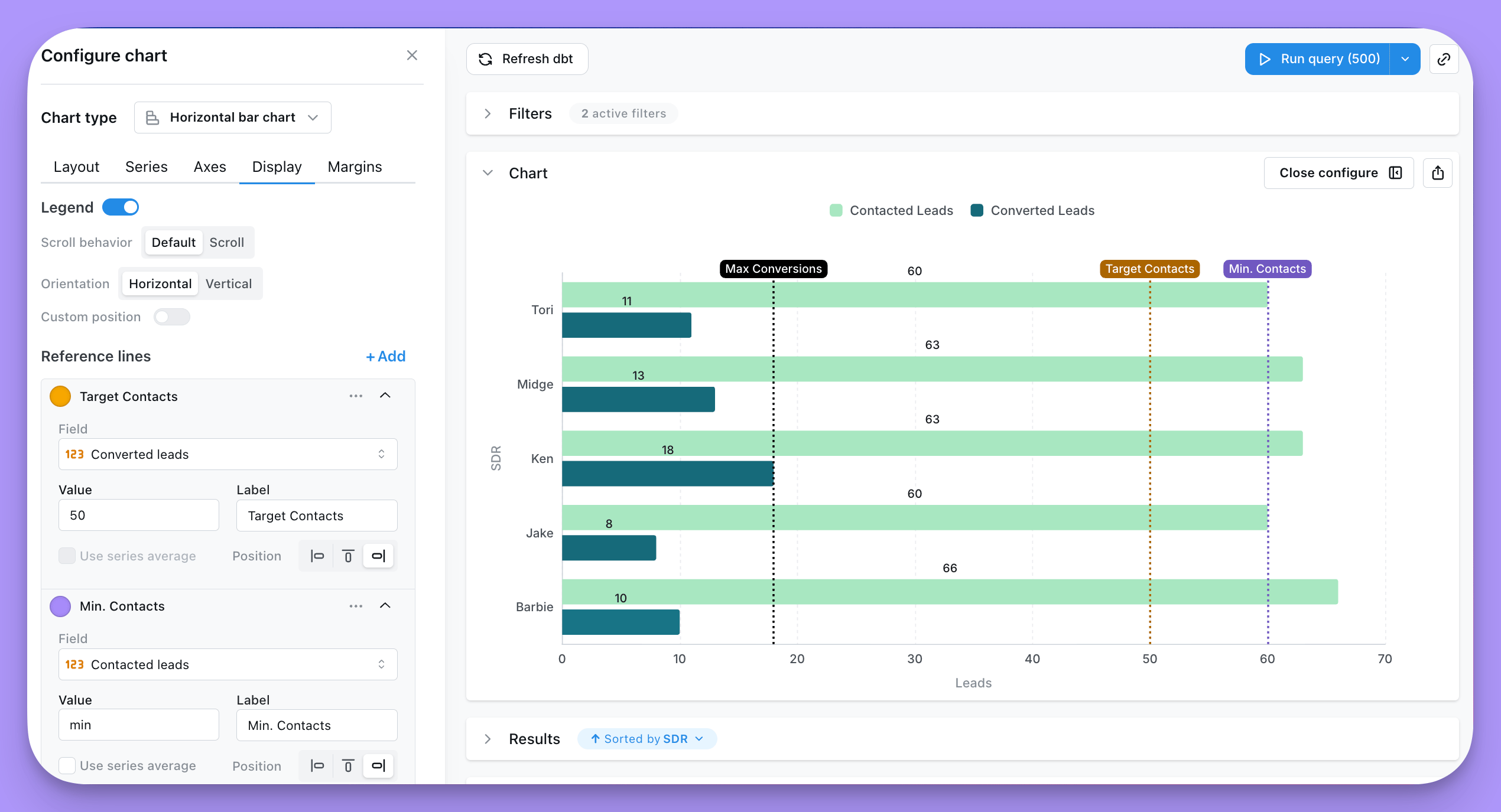 If you select a field plotted on your x-axis, then your line will be vertical. If you select a field plotted on your y-axis, then your line will be horizontal.
If your reference line label is cropped off your chart, try adjusting your [right margin](#margins).
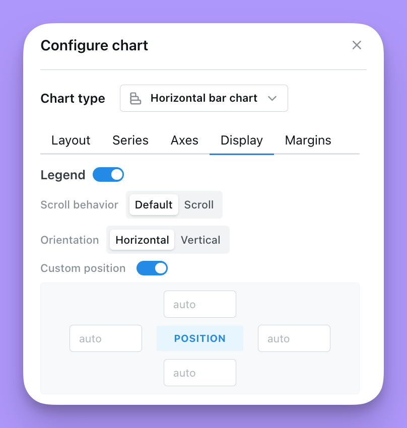
### Legend
You can add and adjust the legend in your chart to help people understand what data's been plotted.
* Show or hide the legend
* Choose a **Placement** for the legend:
* **Chart area** overlays the legend on top of the plot. You can fine-tune its `position`, scroll behavior, and orientation (see below).
* **Outside right** or **Outside left** renders the legend beside the plot and reserves space in the chart grid so the legend never overlaps your data. When you pick an outside placement, set the **Legend area width** (in `%` or `px`) to control how much horizontal space is reserved for the legend.
* When **Placement** is set to **Chart area**:
* Adjust the position of the legend on your chart. The values in `position` are the coordinates of the legend on your chart. They can either be numbers or percent. We suggest using %.
* If you want the position to be in the bottom right, you would set: Right = 0%, Bottom = 0%. For the legend to be in the middle of the chart, you'd set: Top = 50%, Left = 50%.
* Set your legend to scroll (if you have so many groups that they overlap your chart).
* Orient the values in your legend to form a list vertically, or horizontally.
If you select a field plotted on your x-axis, then your line will be vertical. If you select a field plotted on your y-axis, then your line will be horizontal.
If your reference line label is cropped off your chart, try adjusting your [right margin](#margins).
### Legend
You can add and adjust the legend in your chart to help people understand what data's been plotted.
* Show or hide the legend
* Choose a **Placement** for the legend:
* **Chart area** overlays the legend on top of the plot. You can fine-tune its `position`, scroll behavior, and orientation (see below).
* **Outside right** or **Outside left** renders the legend beside the plot and reserves space in the chart grid so the legend never overlaps your data. When you pick an outside placement, set the **Legend area width** (in `%` or `px`) to control how much horizontal space is reserved for the legend.
* When **Placement** is set to **Chart area**:
* Adjust the position of the legend on your chart. The values in `position` are the coordinates of the legend on your chart. They can either be numbers or percent. We suggest using %.
* If you want the position to be in the bottom right, you would set: Right = 0%, Bottom = 0%. For the legend to be in the middle of the chart, you'd set: Top = 50%, Left = 50%.
* Set your legend to scroll (if you have so many groups that they overlap your chart).
* Orient the values in your legend to form a list vertically, or horizontally.
 ## Data
The Data tab lets you trim what gets shown on the chart without changing the underlying query. Both controls run client-side on the already-fetched results, so totals, exports and underlying data are unaffected.
### Limit displayed rows
Toggle **Limit displayed rows** to show or hide a slice of rows from the top or bottom of your results.
## Data
The Data tab lets you trim what gets shown on the chart without changing the underlying query. Both controls run client-side on the already-fetched results, so totals, exports and underlying data are unaffected.
### Limit displayed rows
Toggle **Limit displayed rows** to show or hide a slice of rows from the top or bottom of your results.
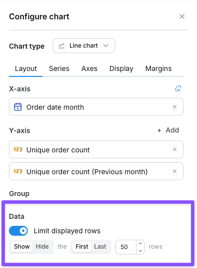 The control reads as a sentence:
* **Show / Hide** — keep only the targeted rows, or remove them.
* **First / Last** — anchor to the top or bottom of the results.
* **N** — how many rows to target (default 50).
Examples:
| Setting | Effect |
| ---------------------- | ------------------------------------------------------------------- |
| Show the first 50 rows | Plot only the top 50 rows; ignore the rest |
| Hide the last 1 row | Drop the bottom row (useful when the trailing period is incomplete) |
| Show the last 12 rows | Plot only the most recent 12 rows of a time series |
The row limit only affects what's drawn on the chart. Your query still returns the full result set, totals are calculated against all rows, and CSV exports include every row.
### Column limit
When your chart has a pivot dimension, the **Column limit** controls how many pivot groups (and therefore series) are drawn. Lightdash keeps the first N pivot groups in display order and drops the rest.
The control reads as a sentence:
* **Show / Hide** — keep only the targeted rows, or remove them.
* **First / Last** — anchor to the top or bottom of the results.
* **N** — how many rows to target (default 50).
Examples:
| Setting | Effect |
| ---------------------- | ------------------------------------------------------------------- |
| Show the first 50 rows | Plot only the top 50 rows; ignore the rest |
| Hide the last 1 row | Drop the bottom row (useful when the trailing period is incomplete) |
| Show the last 12 rows | Plot only the most recent 12 rows of a time series |
The row limit only affects what's drawn on the chart. Your query still returns the full result set, totals are calculated against all rows, and CSV exports include every row.
### Column limit
When your chart has a pivot dimension, the **Column limit** controls how many pivot groups (and therefore series) are drawn. Lightdash keeps the first N pivot groups in display order and drops the rest.
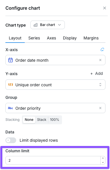 This is useful when a pivot dimension has many values and the chart becomes hard to read. Leave the field blank for no per-chart limit (the system-wide pivot limit still applies — see [the pivot table column limits reference](/references/chart-types/table#column-limits)).
The column limit field only appears when a dimension is configured in the **Group** field.
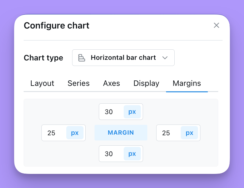
## Margins
The Margin tab is where you're able to add or remove margin around the grid. Removing margin means that your chart will fill more of the space in the chart tab. Adding margin will shrink your chart into a smaller space.
You can either add numbers (e.g. 50) or percent values (e.g. 50%) to the margin settings listed. The default margin is set to `top` = 70, `bottom` = 30, `left` = 5%, `right` = 5%
This is useful when a pivot dimension has many values and the chart becomes hard to read. Leave the field blank for no per-chart limit (the system-wide pivot limit still applies — see [the pivot table column limits reference](/references/chart-types/table#column-limits)).
The column limit field only appears when a dimension is configured in the **Group** field.
## Margins
The Margin tab is where you're able to add or remove margin around the grid. Removing margin means that your chart will fill more of the space in the chart tab. Adding margin will shrink your chart into a smaller space.
You can either add numbers (e.g. 50) or percent values (e.g. 50%) to the margin settings listed. The default margin is set to `top` = 70, `bottom` = 30, `left` = 5%, `right` = 5%